R Code: Taylor’s Towering Year
We’re thrilled about your interest in the code behind this page! We used Quarto for document creation and R for visualizations. Click the ‘See R code’ button for detailed steps. Feel free to explore the Posit Cloud project or clone the GitHub repository to recreate the visuals or the entire article. Happy coding!
Introduction
It’s good to be Taylor Swift.
The 33-year-old singer is a megastar like no other.
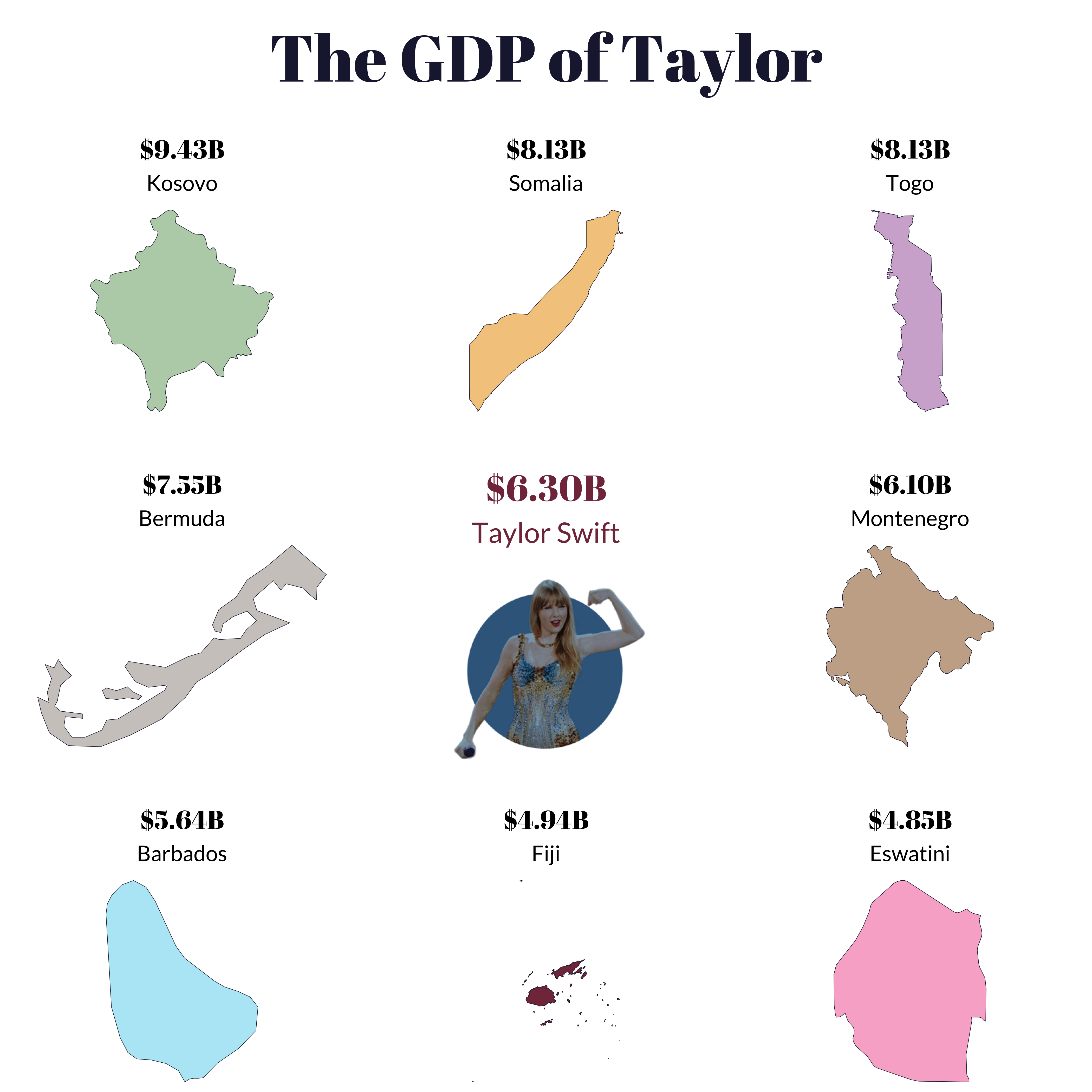
Seven months since the first show in Glendale, Arizona, her Eras Tour has done a projected $2 billion in ticket sales and generated an additional $6.3 billion in direct consumer spending.
Figures that are more in line with the yearly GDP of small nations than a music tour.
What’s remarkable is that The Eras Tour has lined up every demographic and knocked them down like bowling pins.
It’s almost unfathomable to think that you don’t know at least someone who went.
She’s always had teenage girls and moms. But now she has the dads, boyfriends, billionaire tech CEOs, and even NFL linemen singing karma is my boyfriend as confetti falls and fireworks shoot into the night sky of whatever city-turned-Taylorpalooza she’s touring in that evening.
She is the undisputed queen on the pop-culture chessboard, moving seven spaces left, right, up, down, and diagonally, from city to city, picking up everyone in her way and leaving no crumbs.
Just how permeating is Taylor Swift this year?
She and The Eras Tour have done the seemingly impossible: displace football (and virtually every other topic) as the most powerful constant in America’s weekly media diet.
And speaking of football, her new love interest, NFL superstar Travis Kelce, is being called out by another NFL superstar, Aaron Rodgers, for starring in a Pfizer commercial. Just months after Aaron Rodgers went viral for dancing to the live rendition of Style at Taylor’s concert in East Rutherford, New Jersey.
All while CBS Sports, Fox Sports, and ESPN simply can’t keep their cameras focused on the football field, but instead, on her.
It’s fitting that she shouldered her way into the spotlight of one of America’s most sacred traditions: Sunday football, a ritual traditionally associated with beer-drinking boyfriends and middle-aged men who want nothing to do with pop culture.
Yet, there’s Taylor on their screens.
The Eras Tour has simply transcended music. If you were planning to release a song or tour, do it next year. Beatlemania, The Rolling Stones, Coldplay, Michael Jackson - Taylor trumps them all.
We’re so fascinated by the cultural and economic movement that is The Eras Tour that we wanted to break it down ourselves. Let’s see what the data says.
See R code
R Code: The GDP of Taylor Data Visualization
First, we load the packages that we will need.
# To clean data
library(dplyr)
library(tidyr)
library(readr)
library(stringr)
library(purrr)
library(janitor)
# To scrape data
library(rvest)
library(httr)
library(polite)
# To visualize data
library(ggplot2)
library(showtext)
library(rnaturalearth)
library(cowplot)
font_add_google("Abril Fatface", "abril-fatface")
font_add_google("Lato", "lato")
showtext::showtext_auto()The code below retrieves GDP data from a Wikipedia page, processes it, and filters countries based on their World Bank GDP values. It begins by defining the Wikipedia page’s URL and politely scraping the page using {polite}. The HTML content is then extracted and specific tables with the class “wikitable” are selected and converted into a data frame. This data frame, named gdp_tab, undergoes several cleaning steps, including renaming columns, converting certain columns to numeric format, and filtering rows based on World Bank GDP criteria. The resulting data is sorted in descending order of World Bank GDP. Finally, a list of unique countries meeting the specified criteria is stored in the variable countries.
url_gdp <-
"https://en.wikipedia.org/wiki/List_of_countries_by_GDP_(nominal)"
url_gdp_bow <- polite::bow(url_gdp)
url_gdp_bow
gdp_html <-
scrape(url_gdp_bow) |>
html_nodes("table.wikitable") |>
html_table(fill = TRUE)
gdp_tab <-
gdp_html[[1]] |>
clean_names() |>
slice(-1) |>
mutate(across(
c(imf_1_13,
world_bank_14,
united_nations_15),
~ as.numeric(str_replace_all(.x, "[$,]", ""))
)) |>
filter(world_bank_14 < 10000 & world_bank_14 > 4900) |>
arrange(desc(world_bank_14))
url_gdp <-
"https://en.wikipedia.org/wiki/List_of_countries_by_GDP_(nominal)"
url_gdp_bow <- polite::bow(url_gdp)
url_gdp_bow
gdp_html <-
scrape(url_gdp_bow) |>
html_nodes("table.wikitable") |>
html_table(fill = TRUE)
gdp_tab <-
gdp_html[[1]] |>
janitor::clean_names() |>
slice(-1) |>
mutate(across(
c(imf_1_13,
world_bank_14,
united_nations_15),
~ as.numeric(str_replace_all(.x, "[$,]", ""))
)) |>
filter(world_bank_14 < 10000 & world_bank_14 > 4000) |>
arrange(desc(world_bank_14))
countries <- unique(gdp_tab$country_territory)Below, we create geographic plots for Fiji and several other countries, with custom styling and GDP-related information displayed on each plot. The countries vector contains a list of countries, and corresponding fill colors are specified in the colors vector. The country_plots function is defined to generate individual plots for each country. The purrr::map2 function applies the country_plots function to each country in the countries vector with matching fill colors. Additionally, a separate plot (p_blank) is created specifically for Taylor Swift, featuring a custom title and subtitle displaying her estimated wealth.
fiji <-
ne_countries(scale = 10,
returnclass = "sf",
country = "Fiji")
p_Fiji <-
ggplot(fiji) +
geom_sf(fill = "#823549",
color = "#1D1E3C") +
coord_sf(crs = 3460) +
theme_void() +
labs(
subtitle = gdp_tab |> filter(country_territory == "Fiji") |> pull(country_territory),
title = scales::dollar(
gdp_tab |>
filter(country_territory == "Fiji") |>
pull(world_bank_14),
big.mark = ".",
scale = 1e-3,
suffix = "B"
)
) +
theme(
plot.subtitle = element_text(
size = 20,
margin = margin(10, 0, 8.5, 0, unit = "pt"),
family = "lato",
hjust = 0.5
),
plot.title = element_text(hjust = 0.5,
margin = margin(50, 0, 5.5, 0, unit = "pt")),
title = element_text(
size = 20,
family = "abril-fatface",
margin = margin(36, 0, 5.5, 0, unit = "pt")
)
)
countries <-
c("Kosovo",
"Somalia",
"Togo",
"Bermuda",
"Montenegro",
"Barbados",
"Eswatini")
colors <-
c("#b9d2b5",
"#f4cb8d",
"#d1b2d2",
"#CFCAC6",
"#C8AE95",
"#b5e9f6",
"#F9B2D0")
country_plots <- function(country, fill) {
country_data <-
rnaturalearth::ne_countries(scale = 10,
returnclass = "sf",
country = country)
p <- ggplot(country_data) +
geom_sf(fill = fill,
color = "#1D1E3C") +
coord_sf() +
theme_void() +
labs(
subtitle = gdp_tab |> filter(country_territory == country) |>
pull(country_territory),
title = scales::dollar(
gdp_tab |> filter(country_territory == country) |> pull(world_bank_14),
big.mark = ".",
scale = 1e-3,
suffix = "B"
)
) +
theme(
plot.subtitle = element_text(
size = 20,
family = "lato",
margin = margin(10, 0, 8.5, 0, unit = "pt"),
hjust = 0.5
),
plot.title = element_text(
hjust = 0.5,
lineheight = 6.5,
margin = margin(50, 0, 5.5, 0, unit = "pt")
),
title = element_text(
size = 20,
margin = margin(50, 0, 5.5, 0, unit = "pt"),
family = "abril-fatface"
)
)
plot_name <- paste0("p_", country)
assign(plot_name, p, envir = .GlobalEnv)
}
map2(.f = country_plots, .x = countries, .y = colors)
# One specifically for Taylor Swift
p_blank <-
ggplot() +
labs(subtitle = "Taylor Swift",
title = "$6.30B") +
theme_void() +
theme(
plot.subtitle = element_text(
margin = margin(10, 0, 5.5, 0, unit = "pt"),
size = 26,
family = "lato",
hjust = 0.5
),
plot.title = element_text(hjust = 0.5,
margin = margin(50, 0, 10, 0, unit = "pt")),
title = element_text(
margin = margin(50, 0, 15, 0, unit = "pt"),
size = 28,
family = "abril-fatface",
hjust = 1,
color = "#823549"
)
)Next, we generate a composite plot (gdp_plot) using the plot_grid function from the {cowplot} package. The plot grid includes individual country plots for Kosovo, Somalia, Togo, Bermuda, a custom plot for Taylor Swift (p_blank), Montenegro, Barbados, Fiji, and Eswatini. The align parameter is set to “v,” aligning the plots vertically. Additionally, the code incorporates an image of Taylor Swift (gdp-taylor.png) using the draw_image function, positioning it at specific coordinates within the plot. A label is added with the text “The GDP of Taylor” using draw_label, adjusting its position, font family, size, and color. The overall theme of the plot is modified with a margin adjustment using the theme function. The resulting gdp_plot combines individual country plots with a custom element representing Taylor Swift’s GDP.
gdp_plot <-
plot_grid(
p_Kosovo,
p_Somalia,
p_Togo,
p_Bermuda,
p_blank,
p_Montenegro,
p_Barbados,
p_Fiji,
p_Eswatini,
align = "v"
) +
draw_image(
here::here("images", "gdp-taylor.png"),
x = 0.4,
y = 0.32,
width = 0.2,
height = 0.2
) +
draw_label(
"The GDP of Taylor",
x = 0.5,
y = 1.05,
hjust = 0.5,
vjust = 1,
fontfamily = "abril-fatface",
size = 60,
color = "#1D1E3C"
) +
theme(plot.margin = margin(80, 0, 0, 0))The ggsave function from the ggplot2 package saves the composite plot (gdp_plot) as a PNG image.
ggsave(
filename = here::here("images", "gdp_plot.png"),
plot = gdp_plot,
device = png,
path = NULL,
width = 14,
height = 14,
units = "in",
dpi = 300,
limitsize = TRUE,
bg = "white"
)
Setting the stage
Taylor Swift’s first tour in 5 years kicked off in Glendale, Arizona, on March 17th, after six months of rabid internet behavior by millions of Swifties doing everything and anything trying to get a ticket.
Demand was crushing. And Ticketmaster, the sole supplier of 2023’s golden ticket, totally botched it.
On November 15th, the first day of the presale, Ticketmaster’s website crashed within an hour, leaving most fans with presale codes stranded in confusion and endlessly bouncing around in the purchase queue.
Some lucky fans were given presale codes. Most were demoted to a waitlist. The only two other options were testing your luck during the general sale (following the presale) or preparing yourself to swallow the stomach-churning premiums priced into resale tickets. None of those logistical details ended up meaning anything.
Popular gambling website Bookies.com estimates that only 5% of fans with presale codes could purchase a ticket directly via the process.
@pineapplepaperco Thanks Ticketmaster, for being lame. 😡😡😡😡 We will see how this plays out I guess #taylorswift #taylornation #taylorswiftchallenge ♬ Anti-Hero - Taylor Swift
Ticketmaster then double-downed on its incompetency, canceling the general sale of tickets, causing the price of resale tickets to surge to thousands of dollars per ticket for some shows.
All of this triggered what can most aptly be called the Taylor Economy.
Millions of Swifties hit up every person they could think of who had a shot at procuring them tickets. Estranged family members, coworkers they don’t particularly like, sisters of ex-boyfriends – hopeful tour goers sent out feelers equivalent to a shameless “u up?” 2 AM text to any potential lead.
The algebra suddenly became it’s cheaper to fly to Denver and spend a night at a hotel than it is to see her just 15 minutes away in Downtown LA.
And people did fly. In droves. Imagine you’re settling on board in the middle seat at the back of an airplane - maybe a little groggy from the night before - and half the plane starts belting out Love Story.
No distance was too far, no logistics were too insane for Swifties to get into the building - any building in any city - for The Eras Tour.
It is our humble belief that every major hotel chain and airline CFO needs to put Taylor Swift on their lists of people who deserve a generous bonus come the holiday season.
According to research firm STR, The Eras Tour generated almost $100M in hotel revenue in its first three months.
In Cincinnati, a single room at the Days Inn was going for over $1,000 during her tour dates, compared to just $72 one week later. In Atlanta, $900.
See R code
R Code: Taylor Swift Economic Impact Map
To create the Taylor Swift Economic Impact Map, we first load the packages that we will need.
# To clean data
library(dplyr)
library(tidyr)
library(readr)
# To geocode data
library(tidygeocoder)
# To make the map
library(leaflet)
library(leaflet.extras)
library(htmltools)Now, we read a CSV file (“taylor-economic-impact.csv”) using the read_csv() function from the readr package. We geocode the data using the tidygeocoder package. The package uses OpenStreetMap’s geocoding service to translate location information (latitude and longitude) into geographic coordinates.
impact <-
read_csv(here::here("data", "taylor-economic-impact.csv"))
impact_geo <-
impact |>
geocode(location,
method = "osm",
lat = latitude,
long = longitude)Finally, we can use the leaflet package to create an interactive map displaying markers for various locations indicating Taylor’s economic impact.
taylorIcon <-
makeIcon(
iconUrl = here::here("images", "map-taylor.png"),
iconWidth = 64,
iconHeight = 64,
iconAnchorX = 22,
iconAnchorY = 94,
shadowUrl = "http://leafletjs.com/examples/custom-icons/leaf-shadow.png",
shadowWidth = 50,
shadowHeight = 64,
shadowAnchorX = 4,
shadowAnchorY = 62
)
labelText = paste0(
"<b>",
impact_geo$location,
"</b>",
"<br/>",
"<br/>",
impact_geo$news,
"<br>",
"<br>",
'<a href="',
impact_geo$Source,
'">Source</a>'
) |>
lapply(htmltools::HTML)
lng <- -102.3
lat <- 36.8
leaflet(data = impact_geo,
options = leafletOptions(zoomControl = FALSE,
scrollWheelZoom = FALSE)) |>
setView(lng, lat, zoom = 4) |>
addProviderTiles("Esri.WorldGrayCanvas",
options = tileOptions(maxZoom = 12)) |>
setMaxBounds(
lng1 = -153.8,
lat1 = -25.2,
lng2 = 176.7,
lat2 = 63.5
) |>
addMarkers(
~ longitude,
~ latitude,
label = ~ labelText,
labelOptions = labelOptions(maxWidth = 50),
icon = taylorIcon
) |>
addEasyButton(easyButton(
icon = "fa-search-plus",
title = "Zoom In",
onClick = JS("function(btn, map) { map.zoomIn(); }")
)) |>
addEasyButton(easyButton(
icon = "fa-search-minus",
title = "Zoom Out",
onClick = JS("function(btn, map) { map.zoomOut(); }")
)) |>
suspendScroll(wakeMessage = "Drag to move the map") |>
addResetMapButton()
The power of Taylor Swift is that none of this chaos ultimately mattered.
She denounced Ticketmaster in an Instagram story and apologized to her fans, comparing the process of getting a ticket to going through several bear attacks.
And on March 17th, she kicked off the tour with Miss Americana & The Heartbreak Prince in front of 75,000 shrieking, crying, and euphoric Swifties at State Farm Stadium. The several bear attacks endured to get there – forgotten.
In the limelight
Seven months in, there’s no other way to put it.
The Eras Tour in Numbers
- 151 shows
- 5 continents
- 17 countries
- 50 cities
- 44 songs
- $2.4B estimated gross
- 10M estimated attendance
The Eras Tour is a massive success.
Over 10 million estimated attendees. $2 billion in estimated gross revenue. To put these numbers into perspective, her 2018 Reputation Tour had 3 million attendees and did only $440 million gross.
See R code
R Code: Taylor Tour Gross Treemap
First, we load the packages that we will need.
# To clean data
library(tidyverse)
library(janitor)
# To scrape data
library(rvest)
library(httr)
library(polite)
# To visualize data
library(ggplot2)
library(showtext)
library(treemapify)
library(cowplot)
font_add_google("Abril Fatface", "abril-fatface")
font_add_google("Lato", "lato")
showtext::showtext_auto()Below, we extract information about Taylor Swift’s live performances from a Wikipedia page. The code begins by defining the URL of the page. The HTML content is then scraped and specific tables with the class “wikitable” are selected and converted into a data frame (ind_tab). We go through a few cleaning steps, including renaming columns, converting certain columns to numeric format, and adjusting values for specific tours. Additionally, the code creates new columns for labels and images associated with each tour, incorporating HTML styling.
url <-
"https://en.wikipedia.org/wiki/List_of_Taylor_Swift_live_performances"
url_bow <- polite::bow(url)
url_bow
ind_html <-
scrape(url_bow) |>
html_nodes("table.wikitable") |>
html_table(fill = TRUE)
ind_tab <-
ind_html[[1]] |>
janitor::clean_names() |>
mutate(across(
c(adjusted_gross_in_2023_dollar,
gross,
attendance),
~ as.numeric(str_replace_all(.x, "[$,]", ""))
)) |>
mutate(
attendance = case_when(title == "The Eras Tour" ~ 10512000,
.default = attendance),
gross = case_when(title == "The Eras Tour" ~ 2400000000,
.default = gross),
adjusted_gross_in_2023_dollar = case_when(title == "The Eras Tour" ~ 2400000000,
.default = adjusted_gross_in_2023_dollar),
label = paste0(
title,
"<br><span style='font-size:20pt'>",
scales::dollar(adjusted_gross_in_2023_dollar),
"</span>"
),
# To make the Fearless rectangle a little bigger and The Eras Tour font a little small
adjusted_gross_in_2023_dollar2 = case_when(
title == "Fearless Tour" ~ adjusted_gross_in_2023_dollar * 1.5,
title == "The Eras Tour" ~ adjusted_gross_in_2023_dollar * 0.9,
.default = adjusted_gross_in_2023_dollar
)
)Now, we create a treemap visualization using the {treemapify} package to represent Taylor Swift’s live performances based on adjusted gross income in 2023 dollars. We start by generating a treemap using the treemapify() function, where the area of each rectangle corresponds to the adjusted gross income. The resulting treemap is then joined back to the original data frame (ind_tab) to include additional details.
The code calculates the total adjusted gross income for all performances and creates a new treemap (taylor_treemap) using {ggplot2.} The treemap is customized with color-coded rectangles representing different tours, and the label for each rectangle includes the tour name and its adjusted gross income in billion dollars.
treemap <-
treemapify(ind_tab, area = "adjusted_gross_in_2023_dollar")
treemap <-
left_join(ind_tab, treemap |> select(title, ymax:xmax))
total <- sum(ind_tab$adjusted_gross_in_2023_dollar)
taylor_treemap <-
treemap |>
ggplot(
aes(
area = adjusted_gross_in_2023_dollar2,
fill = title,
label = paste(
title,
scales::dollar(
adjusted_gross_in_2023_dollar,
scale = 1e-9,
suffix = "B"
),
sep = "\n"
),
xmin = xmin,
ymin = ymin,
xmax = xmax,
ymax = ymax
)
) +
geom_treemap() +
draw_image(
here::here("images", "rev-by-tour-bg.png"),
scale = 1.5,
x = 0,
y = 0.16
) +
geom_treemap_text(
colour = "white",
place = "center",
grow = TRUE,
reflow = FALSE,
family = "abril-fatface"
) +
labs(
title = scales::dollar(
total,
big.mark = ".",
scale = 1e-9,
suffix = "B"
),
sep = "\n"
) +
theme_void() +
theme(
legend.position = "none",
plot.title = element_text(
size = 90,
family = "abril-fatface",
hjust = 0.5,
color = "#1D1E3C"
)
)The ggsave function from the ggplot2 package saves the composite plot (taylor_treemap) as a PNG image.
ggsave(
filename = here::here("images", "taylor_treemap.png"),
plot = taylor_treemap,
device = png,
path = NULL,
width = 10,
height = 6.5,
units = "in",
dpi = 300,
limitsize = TRUE,
bg = "white"
)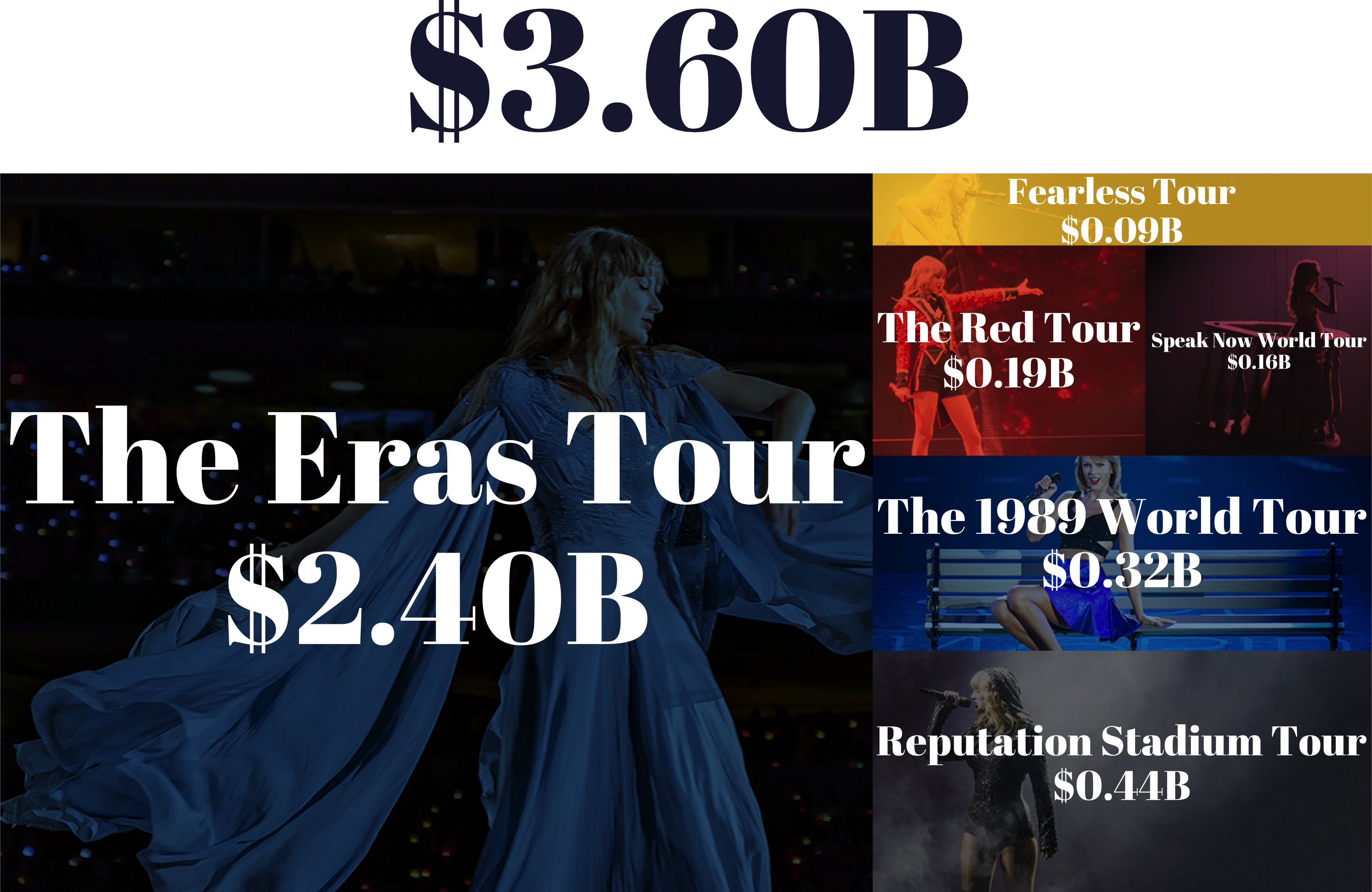
Ignoring the financials, The Eras Tour is just plain massive. A kaleidoscopic, cultural freight train spanning 18 months, 17 countries, 50 cities, 150 shows, and 44 songs topping 3 hours each show.
Reputation was less than a full calendar year and had only 53 shows, approximately a third of the size of Eras in terms of sheer scale.
But Taylor’s not just outdoing herself. We’ve simply never seen a tour quite like Eras.
In the visualization below, you can see how Eras compares to the most successful music tours in the 2000s. The visualization takes into consideration artists who tour over long periods of time, such as the Rolling Stones and Ed Sheeran.
See R code
R Code: Highest Grossing Tours Sankey Chart
To create the Highest Grossing Tours Sankey Chart, we first load the packages that we will need.
# To load and clean data
library(dplyr)
library(tidyr)
library(readr)
library(stringr)
library(forcats)
# To visualize the data
library(ggplot2)
library(scales)
library(glue)
library(ggsankey) # get at https://github.com/davidsjoberg/ggsankey
library(ggtext)
library(colorspace)
library(ggh4x)Borrowing heavily from Georgios Karamanis’ #TidyTuesday post, where he shared an alluvial bump chart made with {ggsankey} with data from UNHCR, the UN Refugee Agency. The heaviest lift came from {ggsankey}, the R Package for making beautiful sankey, alluvial and sankey bump plots in ggplot2
First, we’re going to load our data, collected manually from Pollstar reporting over the last 20 years. Artist names need to be cleaned up, and we need to structure our dataset for the Sankey Bump plot.
rank_concert_tours <- read_csv(here::here("data", "rank_concert_tours.csv")) |>
mutate(
artist = case_when(
artist == "Tim McGraw/Faith Hill" ~ "Tim Mcgraw et. al.",
artist == "Tim McGraw / Faith Hill" ~ "Tim Mcgraw et. al.",
artist == "Kenny Chesney & Tim Mcgraw" ~ "Tim Mcgraw et. al.",
artist == "Michael Jackson The Immortal World Tour By Cirque Du Soleil" ~ "Michael Jackson",
artist == "Bruce Springsteen & The E Street Band" ~ "Bruce Springsteen & the E Street Band",
artist == "Jay-Z / Beyoncé" ~ "Beyoncé & Jay Z",
artist == "Beyoncé and Jay Z" ~ "Beyoncé & Jay Z",
artist == "Billy Joel/Elton John" ~ "Billy Joel & Elton John" ,
artist == "“Summer Sanitarium Tour”/Metallica" ~ "Metallica",
artist == "'N Sync" ~ "Nsync",
.default = artist
)
)
for (YEAR in unique(rank_concert_tours$year)) {
# print(as.character(YEAR))
year_tbl <- rank_concert_tours |>
filter(year == YEAR)
add_tbl <- tibble(
year = YEAR,
artist = (rank_concert_tours$artist |> unique())[!(rank_concert_tours$artist |> unique() %in% year_tbl$artist)],
gross = 1
)
add_tbl$rank <- 11:(nrow(add_tbl) + 10)
year_tbl <- year_tbl |>
bind_rows(add_tbl)
rank_concert_tours <- year_tbl |>
bind_rows(rank_concert_tours |>
filter(year != YEAR))
}
rank_concert_tours <- tibble(rank_concert_tours) |>
arrange(year, rank)
# Set artist as factor, set levels
# This helps the visualization
# artist we want in front
artist_levels <- c(
"Taylor Swift",
"Ed Sheeran",
"The Rolling Stones",
"Bruce Springsteen & the E Street Band",
"U2",
"Elton John",
"Bad Bunny"
)
artist_levels = c(artist_levels,
# everyone else, sorted alphabeically.
(rank_concert_tours$artist |> unique())[!(rank_concert_tours$artist |> unique() %in% artist_levels)] |> sort())
rank_concert_tours$artist <- factor(x = rank_concert_tours$artist,
levels = artist_levels)Now, let’s use {ggplot} and {ggsankey} to build this plot.
The placement of many of the annotations is optimized for the square image output.
# Update with taylor swift colors, https://www.color-hex.com/color-palette/1029201
#b9d2b5 (185,210,181)
ts_pal <- tribble(
~ artist,
~ hex_color,
"Taylor Swift",
"#823549",
"Ed Sheeran",
"#f4cb8d",
"The Rolling Stones",
"#1EB3B3",
"Bruce Springsteen & the E Street Band",
"#0041CC",
"U2",
"#76ad6d",
"Elton John",
"#cc86cf",
"Bad Bunny",
"#6bddfa"
)
# Old colors
# ts_pal <- tribble(
# ~artist, ~hex_color,
# "Bad Bunny", "#1EB3B3",
# "Bruce Springsteen & the E Street Band", "#0041CC",
# "Ed Sheeran", "#e17d17",
# "Elton John", "#A713CC",
# "Taylor Swift", "#CE1126",
# "The Rolling Stones", "#877DB8",
# "U2", "#38C754"
# )
# ts_pal <- c("#1EB3B3","#0041CC","#e17d17","#A713CC","#CE1126","#877DB8","#38C754")
# set text and position of major artist and tour annotation.
annot <- tribble(
~ artist,
~ x,
~ y,
~ total,
~ note,
~ size,
"The Rolling Stones",
2003.5,
1100,
1216000000,
"between 2013-2023",
4.9,
"Bruce Springsteen & the E Street Band",
2010,
1550,
268300000,
"in 2016",
4.9,
"U2",
2013,
1850,
316000000,
"in 2017",
4.9,
"Ed Sheeran",
2017,
2200,
768200000,
"between 2017-2019",
5,
"Elton John",
2018.5,
2500,
334400000,
"in 2022",
4.8,
"Bad Bunny",
2018.5,
2700,
373500000,
"in 2022",
4.8,
"Taylor Swift",
2018.6,
3000,
2400000000,
"Projected",
5.5
) |>
rowwise() |>
mutate(label = glue("**{artist}**<br>{scales::dollar(total)} {note}"))
annot$artist <- factor(x = annot$artist,
levels = artist_levels)
f1 <- "Lato"
f2 <- "Abril Fatface"
# Borrowing (stealling liberally) from Georgios Karamanis:
# exporting manually:
p <- rank_concert_tours |>
mutate(
fill = artist,
fill = ifelse(artist %in% annot$artist, artist, NA),
fill = as.factor(fill)
) |>
ggplot() +
# create Sankey bump plot
geom_sankey_bump(
aes(
x = year,
node = artist,
fill = fill,
value = gross,
color = after_scale(colorspace::lighten(fill, 0.4))
),
linewidth = 0.3,
type = "alluvial",
space = 0,
alpha = 0.9
) +
# Labels for top artists
ggtext::geom_richtext(
data = annot,
aes(
x = x,
y = y,
label = label,
color = artist,
size = size
),
vjust = 0,
family = f1,
fill = NA,
label.color = NA
) +
# More labels
annotate(
"text",
x = 2023.2,
y = 900,
label = "Mid-Year\nTotal\nfor Other\nArtists",
family = f1,
hjust = 0,
vjust = 1,
color = "grey30"
) +
# Title and subtitle
annotate(
"text",
x = 2000,
y = 3500,
label = str_wrap("How does Taylor Swift's Eras Tour Compare to Others?", indent = 0),
size = 8,
family = f2,
fontface = "bold",
hjust = 0,
color = "#181716"
) +
annotate(
"text",
x = 2000,
y = 3370,
label = str_wrap(
"This plot shows rankings and revenue from each year's top ten international music tours between 2000 and 2023. Other top tours & artists are highlighted. ",
50
),
size = 5.5,
family = f1,
hjust = 0,
vjust = 1,
color = "#393433",
lineheight = .9
) +
# Scales, coord, theme
scale_x_continuous(
breaks = seq(2002, 2022, 2),
minor_breaks = NULL,
guide = "axis_minor"
) +
scale_y_continuous(
labels = unit_format(
prefix = "$",
unit = "Billion",
scale = 1e-3
),
limits = c(0, 3600),
breaks = c(1000, 2000),
minor_breaks = NULL
) +
scale_fill_manual(values = ts_pal$hex_color, na.value = "grey80") +
scale_color_manual(values = ts_pal$hex_color, na.value = "grey80") +
scale_size_continuous(range = c(4, 6)) +
coord_cartesian(clip = "off", expand = FALSE) +
labs(caption = "Source: Pollstar. Projection by CNN & QuestionPro") +
theme_minimal(base_family = f1) +
theme(
legend.position = "none",
plot.background = element_rect(fill = "#FFFFFE", color = NA),
axis.title = element_blank(),
axis.text = element_text(
size = 12,
margin = margin(5, 0, 0, 0),
family = f1,
color = "#393433"
),
# axis.ticks.x = element_line(color = "grey70"),
# ggh4x.axis.ticks.length.minor = rel(1),
plot.margin = margin(20, 75, 30, 35),
plot.caption = element_text(margin = margin(10, 0, 0, 0))
)
# p
ggsave(
filename = "../images/tswift-v-others-sankey-sqr.png",
plot = p,
device = png,
path = NULL,
scale = 1,
width = 10,
height = 10,
units = "in",
dpi = 300,
limitsize = TRUE,
bg = NULL
)Rectangle Version, for blog post.
ts_pal_fill <- tribble(
~ artist,
~ hex_color,
"Taylor Swift",
"#823549",
"Ed Sheeran",
"#f4cb8d",
"The Rolling Stones",
"#1EB3B3",
"Bruce Springsteen & the E Street Band",
"#0041CC",
"U2",
"#76ad6d",
"Elton John",
"#cc86cf",
"Bad Bunny",
"#6bddfa"
)
# Set color for annotation
ts_pal_annotcolor <- tribble(
~ artist,
~ hex_color,
"Bad Bunny",
"#6bddfa",
"Bruce Springsteen & the E Street Band",
"#0041CC",
"Ed Sheeran",
"#f4cb8d",
"Elton John",
"#cc86cf",
"Taylor Swift",
"#823549",
"The Rolling Stones",
"#1EB3B3",
"U2",
"#76ad6d"
)
# set text and position of major artist and tour annotation.
annot <- tribble(
~ artist,
~ x,
~ y,
~ total,
~ note,
~ size,
"The Rolling Stones",
2004.5,
1100,
1216000000,
"between 2013-2023",
5,
"Bruce Springsteen & the E Street Band",
2010,
1550,
268300000,
"in 2016",
4.9,
"U2",
2013,
1900,
316000000,
"in 2017",
4.9,
"Ed Sheeran",
2013.5,
2200,
768200000,
"between 2017-2019",
5.1,
"Elton John",
2019,
2250,
334400000,
"in 2022",
4.8,
"Bad Bunny",
2020,
2600,
373500000,
"in 2022",
4.8,
"Taylor Swift",
2019.5,
3150,
2400000000,
"Projected",
5.5
) |> rowwise() |>
mutate(label = glue("**{artist}**<br>{scales::dollar(total)} {note}"))
annot_segments <- tribble(
~ y,
~ yend,
~ x,
~ xend,
~ colour,
1100,
850,
2004.5,
2005,
"The Rolling Stones",
1680,
1500,
2013,
2015.7,
"Bruce Springsteen & the E Street Band",
2250,
2100,
2016.8,
2018,
"Ed Sheeran",
1950,
1800,
2015,
2016.7,
"U2",
2280,
1700,
2019.7,
2021.7,
"Elton John",
2630,
2200,
2020.5,
2021.9,
"Bad Bunny",
3180,
2900,
2019.5,
2022.8,
"Taylor Swift",
)
annot$artist <- factor(x = annot$artist,
levels = artist_levels)
f1 <- "Lato"
f2 <- "Abril Fatface"
# exporting manually:
p2 <- rank_concert_tours |>
mutate(
fill = artist,
fill = ifelse(artist %in% annot$artist, artist, NA),
fill = as.factor(fill)
) |>
ggplot() +
# create Sankey bump plot
geom_sankey_bump(
aes(
x = year,
node = artist,
fill = fill,
value = gross,
color = after_scale(colorspace::lighten(fill, 0.4))
),
linewidth = 0.3,
type = "alluvial",
space = 0,
alpha = 0.9
) +
# Labels for top artists
ggtext::geom_richtext(
data = annot,
aes(
x = x,
y = y,
label = label,
color = artist,
size = size
),
vjust = 0,
family = f1,
fill = NA,
label.color = NA
) +
geom_segment(
data = annot_segments,
aes(
x = x,
xend = xend,
y = y,
yend = yend,
colour = colour
),
size = 1,
alpha = 0.9
) +
# More labels
annotate(
"text",
x = 2023.2,
y = 900,
label = "Mid-Year\nTotal\nfor Other\nArtists",
family = f1,
hjust = 0,
vjust = 1,
color = "grey30"
) +
# Title and subtitle
annotate(
"text",
x = 2000,
y = 3500,
label = str_wrap("How does Taylor Swift's Eras Tour Compare to Others?", indent = 0),
size = 8,
family = f2,
fontface = "bold",
hjust = 0,
color = "#181716"
) +
annotate(
"text",
x = 2000,
y = 3370,
label = paste0(
str_wrap(
"This plot shows rankings and revenue from each year's top ten international music tours between 2000 and 2023.",
60
),
"\n",
"Other top tours & artists are highlighted."
),
size = 5.5,
family = f1,
hjust = 0,
vjust = 1,
color = "#393433",
lineheight = .9
) +
# Scales, coord, theme
scale_x_continuous(
breaks = seq(2002, 2022, 2),
minor_breaks = NULL,
guide = "axis_minor"
) +
scale_y_continuous(
labels = unit_format(
prefix = "$",
unit = "Billion",
scale = 1e-3
),
limits = c(0, 3600),
breaks = c(1000, 2000),
minor_breaks = NULL
) +
scale_fill_manual(
values = c(
"7" = "#6bddfa",
"4" = "#0041CC",
"2" = "#f4cb8d",
"6" = "#cc86cf",
"1" = "#823549",
"3" = "#1EB3B3",
"5" = "#76ad6d"
),
na.value = "grey80"
) +
scale_color_manual(
values = c(
"Bad Bunny" = "#6bddfa",
"Bruce Springsteen & the E Street Band" = "#0041CC",
"Ed Sheeran" = "#f4cb8d",
"Elton John" = "#cc86cf",
"Taylor Swift" = "#823549",
"The Rolling Stones" = "#1EB3B3",
"U2" = "#76ad6d"
),
na.value = "grey80"
) +
scale_size_continuous(range = c(4, 6)) +
coord_cartesian(clip = "off", expand = FALSE) +
labs(caption = "Source: Pollstar. Projection by CNN & QuestionPro") +
theme_minimal(base_family = f1) +
theme(
legend.position = "none",
plot.background = element_rect(fill = "#FFFFFE", color = NA),
axis.title = element_blank(),
axis.text = element_text(
size = 12,
margin = margin(5, 0, 0, 0),
family = f1,
color = "#393433"
),
# axis.ticks.x = element_line(color = "grey70"),
# ggh4x.axis.ticks.length.minor = rel(1),
plot.margin = margin(20, 75, 30, 35),
plot.caption = element_text(margin = margin(10, 0, 0, 0))
)
# p2
ggsave(
filename = "../images/tswift-v-others-sankey-rect.jpg",
plot = p2,
device = jpeg,
path = NULL,
scale = 1,
width = 14,
height = 8,
units = "in",
dpi = 300,
limitsize = TRUE,
bg = NULL
)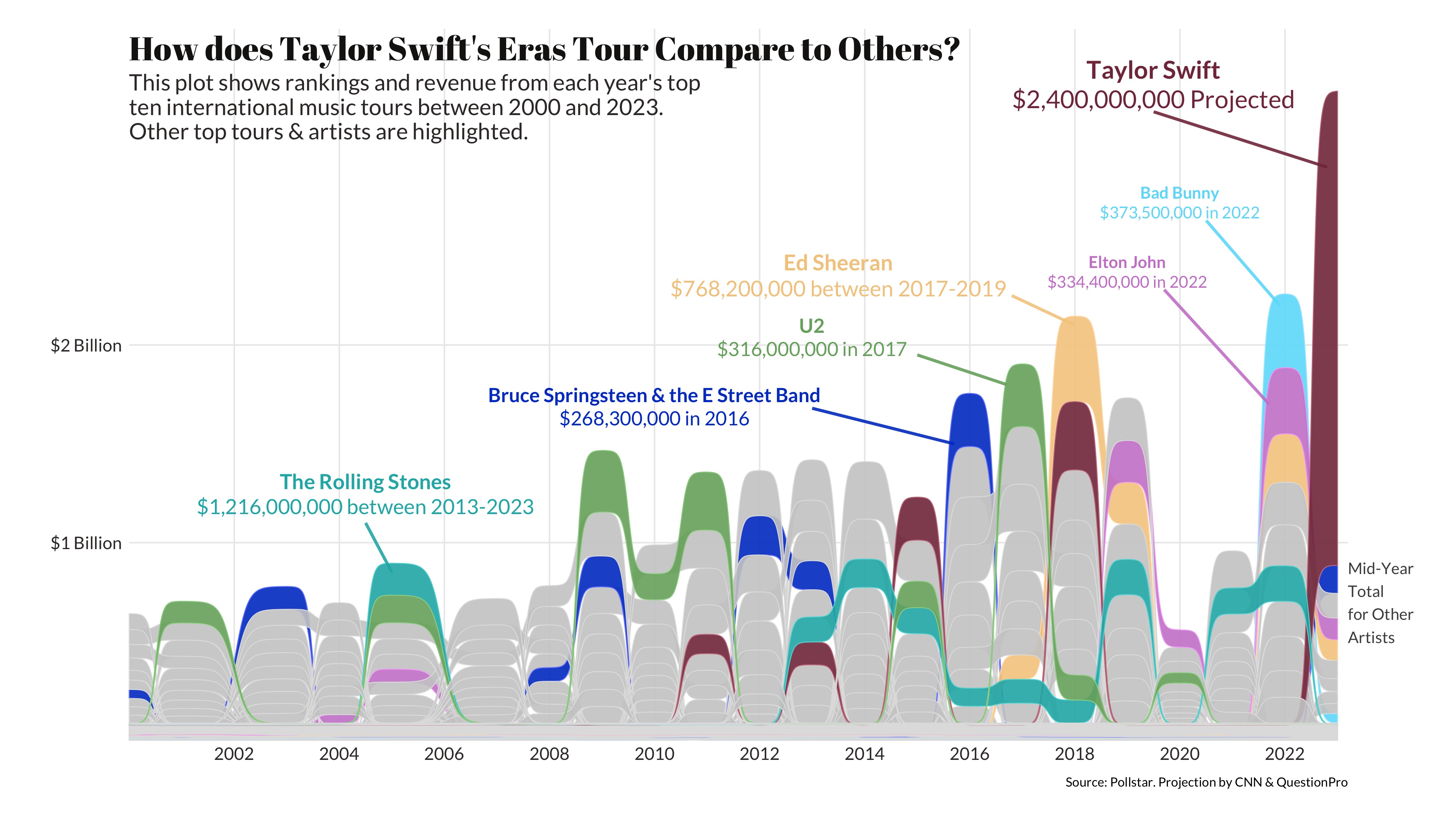
The Rolling Stones is the only other touring group to eclipse the billion-dollar revenue mark but needed nearly ten years (a decade!) to do so.
In one shot - one tour - Eras is projected to do over $2B.
Within this context, The Eras Tour is staggering.
You can flip through and across decades in the application below and reach the same conclusion we did: Taylor and Eras stand alone.
There is simply no one like Taylor Swift and nothing like this tour.
See R code
R Code: Highest Grossing Tours by Decade Charts
To create the Highest Grossing Tours by Decade charts, we first load the packages that we will need.
# Load packages
library(dplyr)
library(tidyr)
library(readr)
library(lubridate)
library(forcats)
library(janitor)
# To scrape data
library(rvest)
library(httr)
library(polite)
# To visualize data
library(ggplot2)
library(ggpattern)
library(showtext)
font_add_google("Abril Fatface", "abril-fatface")
font_add_google("Lato", "lato")
showtext::showtext_auto()Our goal is to compile and organize data about annual highest-grossing concert tours from multiple tables on a Wikipedia page. Below, we extract information about the highest-grossing concert tours from the page. The code starts by defining the URL of the page and scrapes the HTML content using the polite package. Specific tables with the class “wikitable” are selected and converted into a data frame (ind_html).
The code focuses on the ninth table (ind_html[[9]]) containing information about annual highest-grossing concert tours. There’s a function combine_data defined to concatenate multiple tables (from indices 4 to 8 in the ind_html list) into a single tibble (combined_data()).
url <-
"https://en.wikipedia.org/wiki/List_of_highest-grossing_concert_tours"
url_bow <- bow(url)
url_bow
ind_html <-
scrape(url_bow) |>
html_nodes("table.wikitable") |>
html_table(fill = TRUE)
annual_hi_gross_tours <-
ind_html[[9]] |>
janitor::clean_names()
combine_data <- function(ind_html_list) {
combined_data <- tibble::tibble()
for (i in 4:8) {
extracted_data <- ind_html_list[[i]] |> janitor::clean_names()
combined_data <- bind_rows(combined_data, extracted_data)
}
return(combined_data)
}
annual_hi_gross_tours <- combine_data(ind_html)Now we want to clean up the data on annual highest-grossing concert tours, organizing it by decade. A decade column is created by rounding down the year to the nearest decade using the floor_date() function.
tours_by_decade <-
annual_hi_gross_tours |>
dplyr::mutate(across(
c(adjusted_gross_in_2022_dollar,
averagegross,
actual_gross),
~ as.numeric(str_replace_all(.x, "[$,]", ""))
)) |>
mutate(
start_year = str_sub(year_s, start = 1, end = 4),
year = lubridate::ymd(start_year, truncated = 2L)
) |>
mutate(
decade = paste0(stringr::str_sub(
as.factor(floor_date(year, years(10))), start = 1, end = 4
), "s"),
tour_title = case_when(
tour_title == "The Eras Tour †" ~ "The Eras Tour",
tour_title == "Music of the Spheres World Tour †" ~ "Music of the Spheres World Tour",
tour_title == "After Hours til Dawn Tour †" ~ "After Hours til Dawn Tour",
tour_title == "Summer Carnival †" ~ "Summer Carnival",
tour_title == "Global Stadium Tour" ~ "Global Stadium",
.default = tour_title
),
adjusted_gross_in_2022_dollar = case_when(
artist == "Taylor Swift" &
tour_title == "The Eras Tour" ~ 2400000000,
.default = adjusted_gross_in_2022_dollar
),
title = paste0(artist, " - ", tour_title)
)We create a function to generate bar plots based on the decade:
generate_bar_plot <- function(tours_data, decade) {
plot_data <- tours_data |>
ggplot(aes(
x = fct_reorder(title, adjusted_gross_in_2022_dollar),
y = adjusted_gross_in_2022_dollar,
)) +
geom_col_pattern(
aes(pattern_filename = fct_reorder(image, rank)),
pattern = "image",
alpha = 0.8,
pattern_type = "expand"
) +
scale_pattern_filename_discrete(choices = tours_data$image) +
scale_x_discrete(
labels = function(x)
str_wrap(x, width = 20)
) +
labs(
title = paste("Top 10 highest-grossing tours of the", decade),
caption = "Source: Wikipedia"
) +
theme_minimal() +
theme(
axis.title.x = element_blank(),
axis.title.y = element_blank(),
axis.text.x = element_blank(),
legend.position = "none",
title = element_text(
size = 26,
family = "abril-fatface",
hjust = 0.5,
color = "#1D1E3C"
),
plot.margin = unit(c(0, 0, 0, 0.15), "inches")
) +
coord_flip() +
geom_text(aes(label = paste0(
round(adjusted_gross_in_2022_dollar / 1e6, 0), "M"
),
hjust = -0.1), size = 8) +
ylim(0, 2600000000) +
theme(
plot.margin = margin(20, 0, 0, 20),
plot.caption = element_text(size = 14,
family = "lato"),
axis.text = element_text(size = 12)
)
ggsave(
filename = here::here("images", paste0("bar_", decade, ".png")),
plot = plot_data,
device = png,
path = NULL,
width = 14,
height = 8,
units = "in",
dpi = 300,
limitsize = TRUE,
bg = "white"
)
}We need to associate each artist with an image. Then, we can run the data through the function.
tours_1990s <-
tours_by_decade |>
filter(decade == "1990s") |>
mutate(
image = case_when(
artist == "Celine Dion" ~ here::here("images", "tours-images", "1990s", "02dion.jpg"),
artist == "Eagles" ~ here::here("images", "tours-images", "1990s", "04eagles.jpg"),
artist == "Garth Brooks" ~ here::here("images", "tours-images", "1990s", "01brooks.jpg"),
artist == "Michael Jackson" ~ here::here("images", "tours-images", "1990s", "05michael.jpg"),
artist == "Pink Floyd" ~ here::here("images", "tours-images", "1990s", "09pf.jpg"),
artist == "The Rolling Stones" &
tour_title == "Bridges to Babylon Tour" ~ here::here("images", "tours-images", "1990s", "08stones_babylon.jpg"),
artist == "The Rolling Stones" &
tour_title == "Voodoo Lounge Tour" ~ here::here("images", "tours-images", "1990s", "10stones_voodoo.jpg"),
artist == "Tina Turner" ~ here::here("images", "tours-images", "1990s", "03tina.jpg"),
artist == "U2" &
tour_title == "PopMart Tour" ~ here::here("images", "tours-images", "1990s", "07u2_pop.jpg"),
artist == "U2" &
tour_title == "Zoo TV Tour" ~ here::here("images", "tours-images", "1990s", "06u2_zoo.jpg")
)
)
generate_bar_plot(tours_1990s, "1990s")We do the same for the 2000s, 2010s, and 2020s.
tours_2000s <-
tours_by_decade |>
filter(decade == "2000s") |>
mutate(
image = case_when(
title == "The Rolling Stones - A Bigger Bang Tour" ~ "images/tours-images/2000s/stones_bang.jpg",
title == "Madonna - Sticky & Sweet Tour" ~ "images/tours-images/2000s/madonna.jpg",
title == "U2 - Vertigo Tour" ~ "images/tours-images/2000s/u2_vertigo.jpg",
title == "The Police - The Police Reunion Tour" ~ "images/tours-images/2000s/police.jpg",
title == "U2 - U2 360° Tour" ~ "images/tours-images/2000s/u2_360.jpg",
title == "The Rolling Stones - Licks Tour" ~ "images/tours-images/2000s/stones_lick.jpg",
title == "Celine Dion - Taking Chances World Tour" ~ "images/tours-images/2000s/dion.jpg",
title == "Cher - Living Proof: The Farewell Tour" ~ "images/tours-images/2000s/cher.jpg",
title == "AC/DC - Black Ice World Tour" ~ "images/tours-images/2000s/acdc.jpg",
title == "Bruce Springsteen and the E Street Band - Magic Tour" ~ "images/tours-images/2000s/bruce.jpg"
)
)
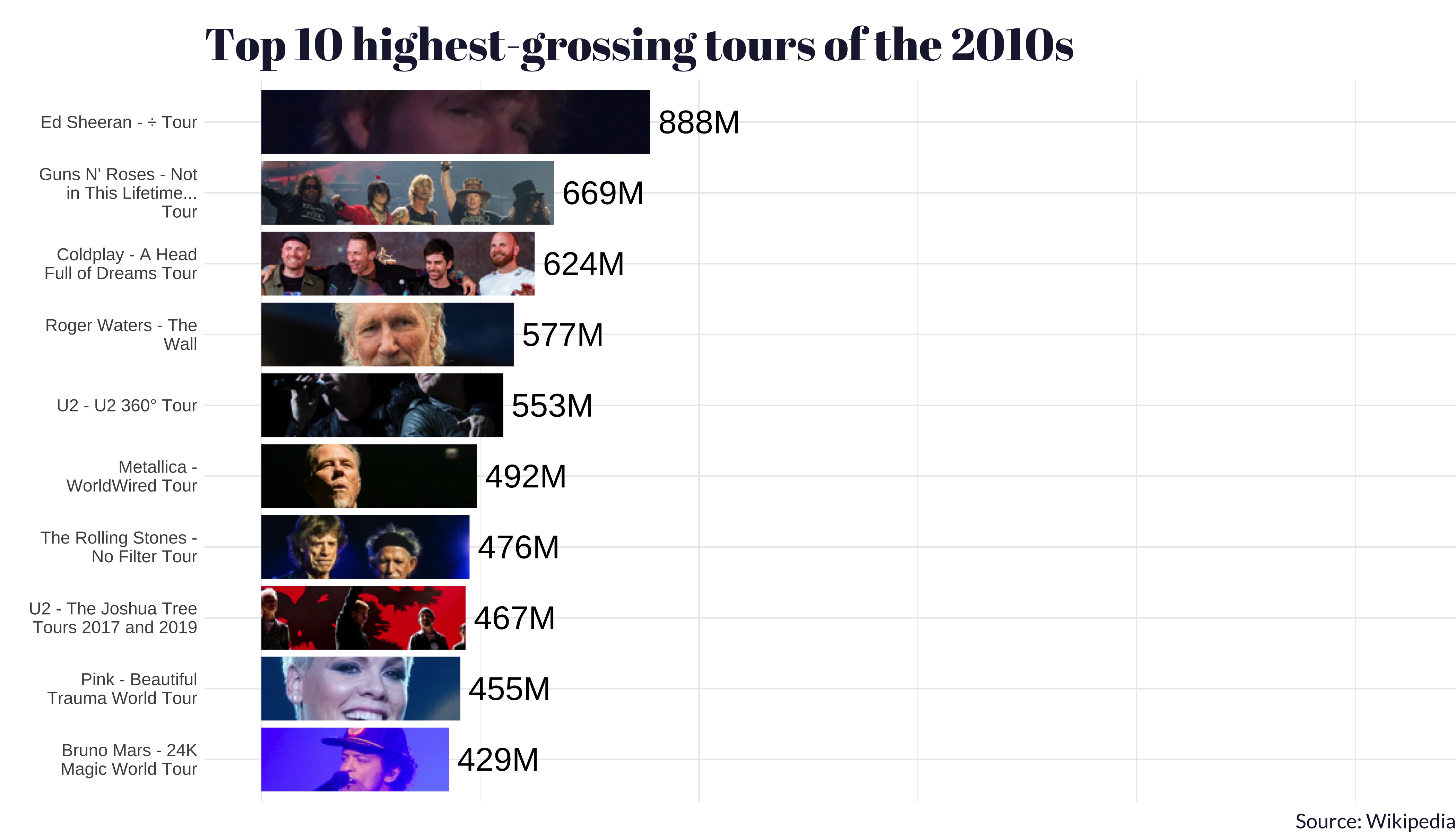
tours_2010s <-
tours_by_decade |>
filter(decade == "2010s") |>
mutate(
image = case_when(
title == "Bruno Mars - 24K Magic World Tour" ~ "images/tours-images/2010s/bruno.jpg",
title == "Coldplay - A Head Full of Dreams Tour" ~ "images/tours-images/2010s/coldplay.jpg",
title == "The Rolling Stones - No Filter Tour" ~ "images/tours-images/2010s/stones.jpg",
title == "Ed Sheeran - ÷ Tour" ~ "images/tours-images/2010s/ed.jpg",
title == "Guns N' Roses - Not in This Lifetime... Tour" ~ "images/tours-images/2010s/gnr.jpg",
title == "Metallica - WorldWired Tour" ~ "images/tours-images/2010s/metallica.jpg",
title == "Pink - Beautiful Trauma World Tour" ~ "images/tours-images/2010s/pink.jpg",
title == "Roger Waters - The Wall" ~ "images/tours-images/2010s/waters.jpg",
title == "U2 - The Joshua Tree Tours 2017 and 2019" ~ "images/tours-images/2010s/u2_josh.jpg",
title == "U2 - U2 360° Tour" ~ "images/tours-images/2010s/u2_360.jpg"
)
)
tours_2020s <-
tours_by_decade |>
filter(decade == "2020s") |>
mutate(
image = case_when(
artist == "Beyoncé" ~ "images/tours-images/2020s/beyonce.jpg",
artist == "Harry Styles" ~ "images/tours-images/2020s/harry.jpg",
artist == "Coldplay" ~ "images/tours-images/2020s/coldplay.jpg",
artist == "Ed Sheeran" ~ "images/tours-images/2020s/ed.jpg",
artist == "Elton John" ~ "images/tours-images/2020s/elton.jpg",
artist == "Bad Bunny" ~ "images/tours-images/2020s/bunny.jpg",
artist == "Pink" ~ "images/tours-images/2020s/pink.jpg",
artist == "Red Hot Chili Peppers" ~ "images/tours-images/2020s/rhcp.jpg",
artist == "The Weeknd" ~ "images/tours-images/2020s/wknd.jpg",
artist == "Taylor Swift" ~ "images/tours-images/2020s/taylor.jpg"
)
)
generate_bar_plot(tours_2000s, "2000s")
generate_bar_plot(tours_2010s, "2010s")
generate_bar_plot(tours_2020s, "2020s")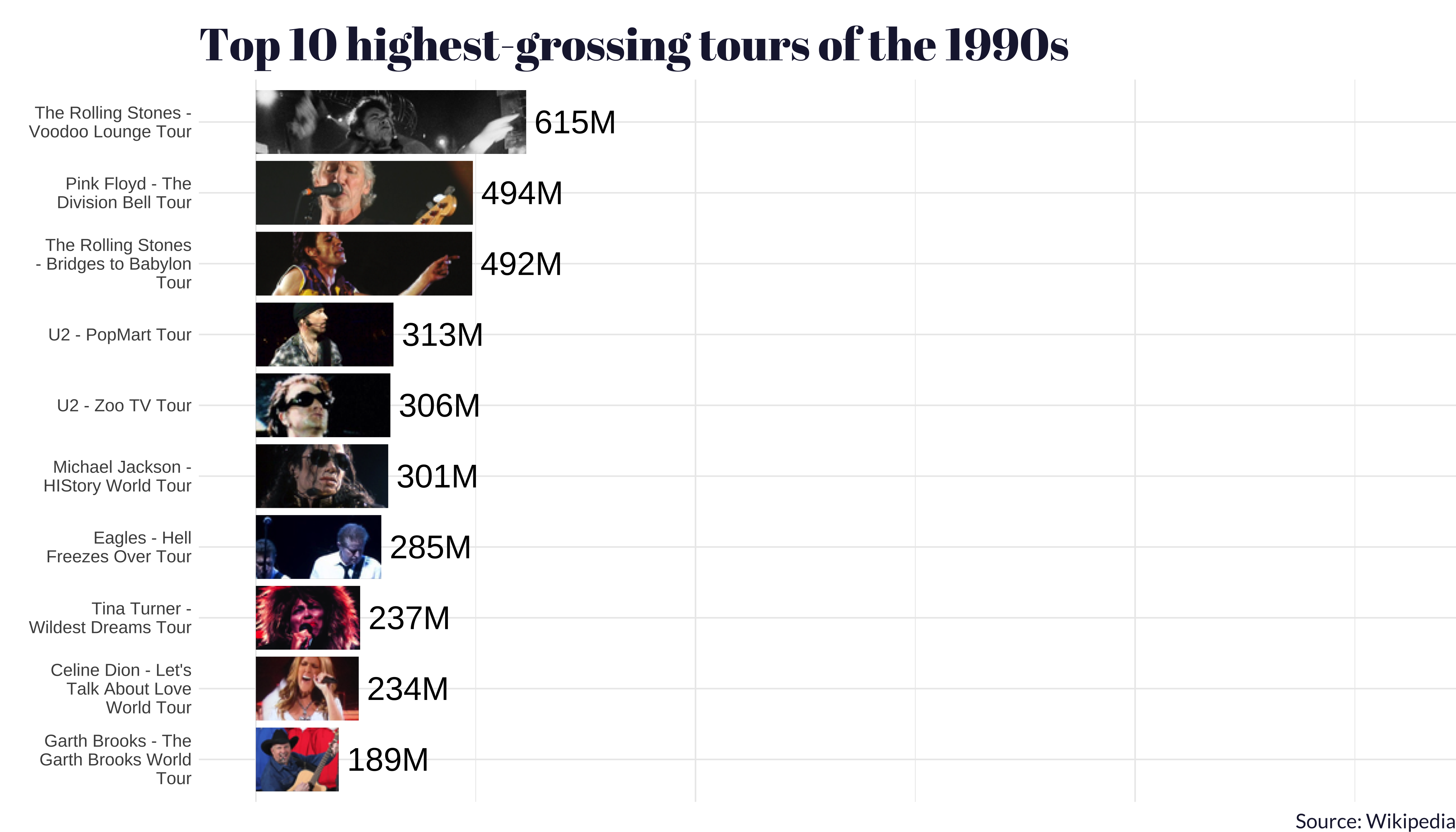
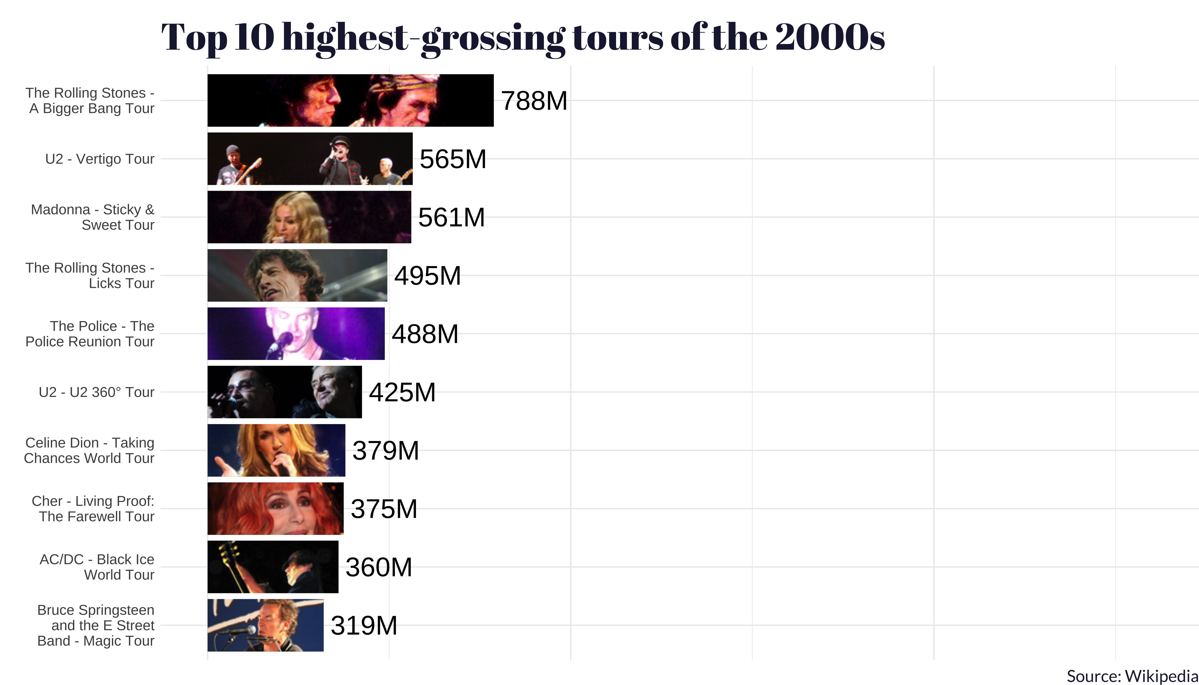
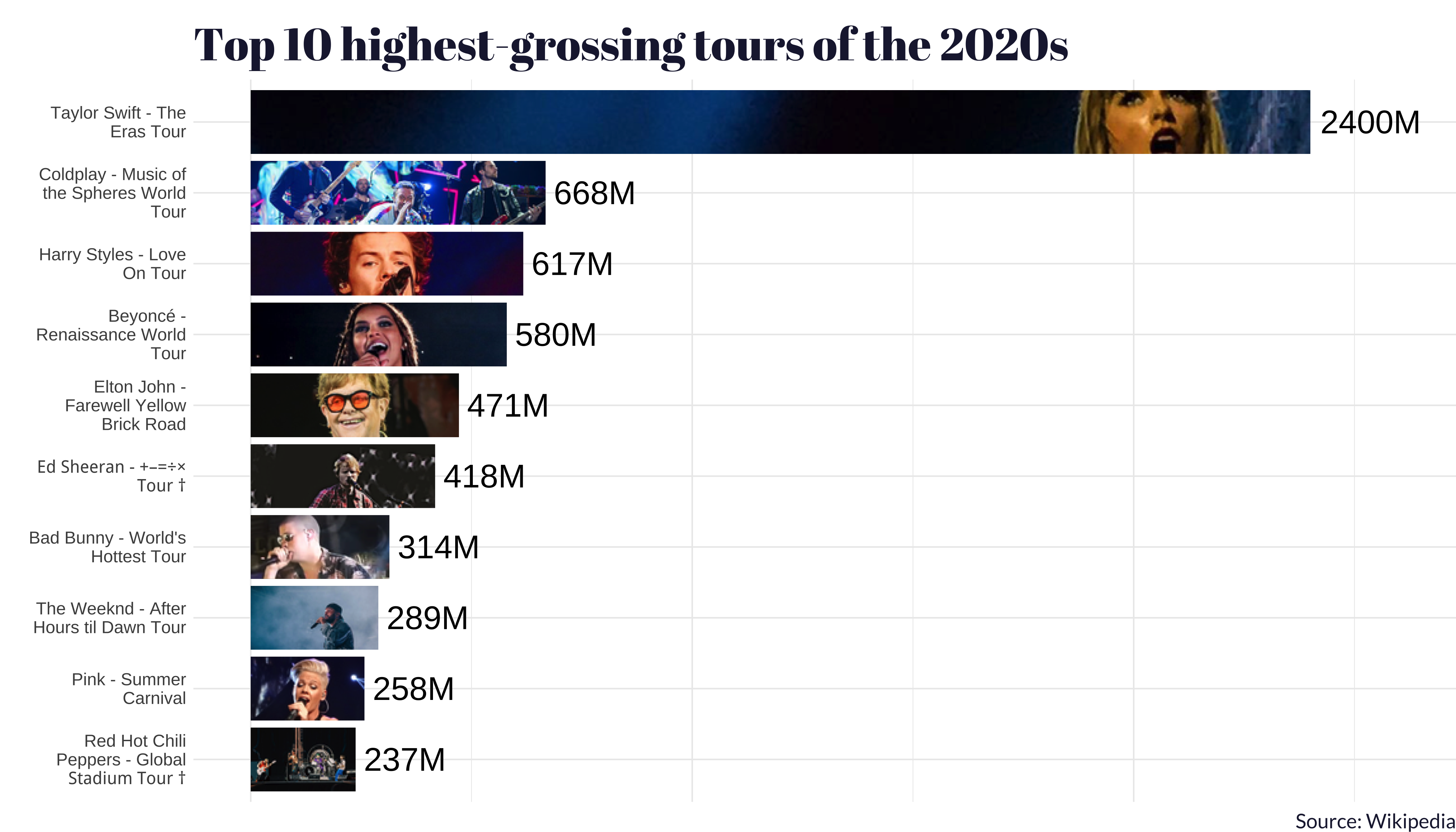
One thing that we think is worth calling out: the tour with the second-highest average gross in the 2020s (so far) was Beyoncé and her Renaissance World Tour.
All to say: bow down to the queens 👑
Opening acts
Finally, we looked at the impact of Taylor Swift on a few of her openers: Gracie Abrams, Beabadoobie, and Paramore.
We wondered: what dividend does Taylor pay to her music industry friends? In the instances of Gracie Abrams and Beabadoobie, you can see a sharp uptick in metrics like Spotify followers, Shazam total plays, and YouTube subscribers immediately after they opened at Eras.
Interestingly, Paramore didn’t seem to benefit from opening at Eras by these metrics. One possible explanation is that Paramore is already hugely popular, so a sharp increase was unlikely.
See R code
R Code: The Eras Tour Openers - Value Boxes
This code creates plots and value boxes for the Taylor Swift opening acts section. The data to create these visualizations were granted to us under license. We may not be able to share it.
library(dplyr)
library(tidyr)
library(readr)
library(plotly)
library(shiny)
library(bslib)
library(bsicons)
library(glue)
openers <-
read_rds(here::here("secret-data", "combined_artist_data.rds")) |>
filter(artist != "Taylor Swift") |>
mutate(date = as.Date(date)) |>
filter(date > as.Date("2022-01-01"))ggplot2::ggplot(
openers |>
filter(stats.source == "shazam",
date > as.Date(2022 - 01 - 01)),
aes(x = as.Date(date), y = shazams_total)
) +
geom_point() +
geom_smooth(method = "lm",
aes(color = time_frame)) +
facet_wrap(~ artist, scales = "free")Below, we create a single artist’s set of plots.
yt_color <- "#F9A395"
yt_text_color <- "#7C1A03"
spotify_color <- "#ADBF99"
spotify_text_color <- "#3B4F29"
shazam_color <- "#A2B8CB"
shazam_text_color <- "#213D4F"
vbs_artists <- list()
# Iterate through all the artists
for (i in 1:length(openers$artist |> unique())) {
artist_i <- (openers$artist |> unique())[i]
# Shazam
p_shazam <- openers |>
filter(stats.source == "shazam",
date > as.Date(2022 - 01 - 01)) |>
filter(artist == artist_i) |>
mutate(date = as.Date(date)) |>
rename(Date = date,
Shazams = shazams_total,
"Time Frame" = time_frame) |>
ggplot(aes(x = Date,
y = Shazams,
text = NULL)) +
geom_line(color = "white",
size = 1.4) +
geom_smooth(
xmethod = "lm",
aes(color = `Time Frame`),
se = FALSE,
size = 0.7
) +
scale_color_manual(values = c(
`after announcement` = "#823549",
`before announcement` = "#1D2642"
)) +
theme(axis.text.x = element_text(colour = "white"),
axis.title = element_text(colour = "white"))
sparkline_shazam <- p_shazam |>
ggplotly() |>
config(displayModeBar = F) |>
layout(
showlegend = FALSE,
xaxis = list(
visible = F,
showgrid = F,
title = ""
),
yaxis = list(
visible = F,
showgrid = F,
title = ""
),
hovermode = "none",
margin = list(
t = 0,
r = 0,
l = 0,
b = 0
),
font = list(color = "white"),
paper_bgcolor = "transparent",
plot_bgcolor = "transparent"
) |>
htmlwidgets::onRender(
"function(el) {
var ro = new ResizeObserver(function() {
var visible = el.offsetHeight > 200;
Plotly.relayout(el, {'xaxis.visible': visible, hovermode: visible,});
});
ro.observe(el);
}"
)
shazams_total = (
openers |>
filter(artist == artist_i,
source_ids == "shazam") |>
arrange(desc(date)) |>
slice(1)
)$shazams_total |>
formatC(big.mark = ",")
# YouTube
p_yt <- openers |>
filter(stats.source == "youtube",
date > as.Date(2022 - 01 - 01)) |>
filter(artist == artist_i) |>
mutate(video_views_total_2 = video_views_total,
date = as.Date(date)) |>
rename(Date = date,
YouTube = video_views_total,
"Time Frame" = time_frame) |>
ggplot(aes(x = Date,
y = YouTube)) +
geom_line(color = "white",
size = 1.4) +
geom_smooth(
xmethod = "lm",
aes(color = `Time Frame`),
se = FALSE,
size = 0.7
) +
scale_y_continuous(trans = 'log2') +
scale_color_manual(values = c(
`after announcement` = "#823549",
`before announcement` = "#1D2642"
)) +
theme(axis.text.x = element_text(colour = "white"),
axis.title = element_text(colour = "white"))
sparkline_yt <- p_yt |>
ggplotly() |>
config(displayModeBar = F) |>
layout(
showlegend = FALSE,
xaxis = list(
visible = F,
showgrid = F,
title = ""
),
yaxis = list(
visible = F,
showgrid = F,
title = ""
),
hovermode = "none",
margin = list(
t = 0,
r = 0,
l = 0,
b = 0
),
font = list(color = "white"),
paper_bgcolor = "transparent",
plot_bgcolor = "transparent"
) |>
htmlwidgets::onRender(
"function(el) {
var ro = new ResizeObserver(function() {
var visible = el.offsetHeight > 200;
Plotly.relayout(el, {'xaxis.visible': visible, hovermode: visible,});
});
ro.observe(el);
}"
)
sparkline_yt$data[[1]]$hoverinfo = 'none'
yt_subs = (
openers |>
filter(artist == artist_i,
source_ids == "youtube") |>
arrange(desc(date)) |>
slice(1)
)$subscribers_total |>
prettyNum(big.mark = ",")
yt_views <- (
openers |>
filter(artist == artist_i,
source_ids == "youtube") |>
arrange(desc(date)) |>
slice(1)
)$video_views_total |>
prettyNum(big.mark = ",")
# Spotify
p_spotify <- openers |>
filter(stats.source == "spotify",
date > as.Date(2022 - 01 - 01)) |>
filter(artist == artist_i) |>
mutate(date = as.Date(date)) |>
rename(
Date = date,
`Monthly Listeners` = monthly_listeners_current,
"Time Frame" = time_frame
) |>
ggplot(aes(x = Date,
y = `Monthly Listeners`,
text = NULL)) +
geom_line(color = "grey90",
size = 1.4) +
geom_smooth(
xmethod = "lm",
aes(color = `Time Frame`),
se = FALSE,
size = 0.7
) +
scale_color_manual(values = c(
`after announcement` = "#823549",
`before announcement` = "#1D2642"
)) +
theme(axis.text.x = element_text(colour = "white"),
axis.title = element_text(colour = "white"))
sparkline_spotify <- p_spotify |>
ggplotly() |>
config(displayModeBar = F) |>
layout(
showlegend = FALSE,
xaxis = list(visible = F,
showgrid = F),
yaxis = list(
visible = F,
showgrid = F,
title = ""
),
hovermode = "none",
margin = list(
t = 0,
r = 0,
l = 0,
b = 0
),
font = list(color = "white"),
paper_bgcolor = "transparent",
plot_bgcolor = "transparent"
) |>
htmlwidgets::onRender(
"function(el) {
var ro = new ResizeObserver(function() {
var visible = el.offsetHeight > 200;
Plotly.relayout(el, {'xaxis.visible': visible, hovermode: visible});
});
ro.observe(el);
}"
)
spotify_total = (
openers |>
filter(artist == artist_i,
source_ids == "spotify") |>
arrange(desc(date)) |>
slice(1)
)$followers_total |>
formatC(big.mark = ",")
# create our value boxes
vbs_artists[[artist_i]] <- list(
# value_box(
# title = "Artist",
# value = h3(glue("{artist_i}")),
# p(),
# showcase = bs_icon("music-note-beamed"),
# style = 'background-color: #3dadad!important;'
# ),
value_box(
title = "YouTube subscribers",
h3(glue("{yt_subs}")),
hr(),
h3(glue("{yt_views}")),
p("Total Views"),
hr(),
p("Plot shows total channel views, Jan 2022 to Oct 2023"),
showcase = sparkline_yt,
full_screen = TRUE,
style = glue(
'background-color: {yt_color}!important;
color: {yt_text_color}!important;'
)
),
value_box(
title = "Shazam Total Plays",
value = h3(glue("{shazams_total}")),
p(),
p("Plot shows total Shazams"),
p("Between Jan 2022 & Oct 2023"),
showcase = sparkline_shazam,
full_screen = TRUE,
style = glue(
'background-color: {shazam_color}!important;
color: {shazam_text_color}!important;'
)
),
value_box(
title = "Spotify Total Followers",
value = h3(glue("{spotify_total}")),
p(),
p("Plot shows monthly listeners"),
p("Between Jan 2022 & Oct 2023"),
showcase = sparkline_spotify,
full_screen = TRUE,
style = glue(
'background-color: {spotify_color}!important;
color: {shazam_text_color}!important;'
)
)
)
}
Genre: Pop
Origin: Los Angles, CA
First Album: Good Riddance
"I found out about (opening for Swift) through my agent and I immediately texted Taylor," Abrams said. "I don’t even remember. I just blacked out. I wouldn’t believe it at all. This couldn’t be real life. All I can think about is how insane an opportunity it is to watch her perform every night. I’m so lucky to be a part of that tour. It’s the greatest master class in the world, being able to see the person who’s the best at this, ever, do it so many times.
Shazam Total Plays
2,045,665
Plot shows total Shazams
Between Jan 2022 & Oct 2023
Spotify Total Followers
1,275,816
Plot shows monthly listeners
Between Jan 2022 & Oct 2023

Genre: Pop
Origin: London, England
First Album: Fake it Flowers
In an interview with People magazine, Bea shared that "It didn't feel real" when during Swift's acoustic portion of the show, the headliner revealed she read an interview with Bea, who grew up with Swift's debut LP. "I figured for her first show with us, I'd play that specific song that she said she wanted to hear," Swift told her crowd, before performing "Our Song," in dedication to Bea. "Imagine someone that you've listened to growing up and almost shaped your childhood being like, 'This is for young Bea.' And I'm like, well, f— my life. I'm going to die. It's like all the problems have just been solved in that [moment]," shared Bea during her interview with People magazine.
YouTube subscribers
1,055,258
757,920,143
Total Views
Plot shows total channel views, Jan 2022 to Oct 2023
Spotify Total Followers
2,547,718
Plot shows monthly listeners
Between Jan 2022 & Oct 2023

Genre: Rock
Origin: Franklin, TN
First Album: All We Know is Falling
Really can’t contain my excitement because … we’re adding 14 new shows to The Eras Tour. And I get to travel the world doing shows with @paramore!! @yelyahwilliams and I have been friends since we were teens in Nashville and now we get to frolic around the UK/Europe next summer??? I’m screaming???" - Taylor Swift when announcing Paramore would be opening for her during The Eras Tour
Shazam Total Plays
20,143,712
Plot shows total Shazams
Between Jan 2022 & Oct 2023
Spotify Total Followers
8,122,423
Plot shows monthly listeners
Between Jan 2022 & Oct 2023
Curtain call
We’re inclined to say, “Take a bow, Taylor Swift!”
But she’ll do that for at least another calendar year at the end of every show as Eras stretches into late 2024.
She is the tide that lifts all boats, flights, and hotel prices.
The Eras Tour is its own economy, dealing in billions of dollars with a capital B.
The five-year wait since Reputation, the hundred thousand dollar bonuses to her employees, and the bear attacks her millions of fans endured to get their hands on tickets – clearly, all worth it.
So kudos to you, Taylor: you and Eras are truly 1 of 1 in the pantheon of music.